CalmWard
CalmWard is an omni-channel patient experience that brings comfort back into hospital stays. Its smooth, intuitive, and stress-free interface enables patients to easily manage noise and lighting in their room.
Jul 2025 - Nov 2025
TEAM
Cynthia Ni + 2 Team Members
PROJECT TYPE
Uni Project- Interaction design Studio
TOOLS
Figma
MY ROLE & IMPACT
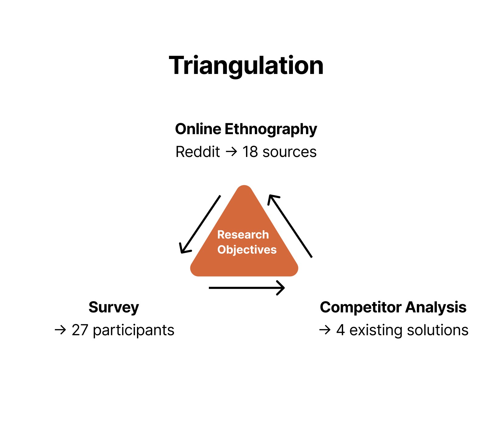
I guided the project from concept to prototype, leading ethnographic research, competitor analysis, design system development, user testing, and iterative refinement.
Impact Summary
😌 By prioritizing what matters most to the users, we created an interface that addresses patients’ feelings of fatigue, discomfort, and hesitation expressed in our research.
🛌 The final design feels intuitive to use, and supports a calm, restful experience.
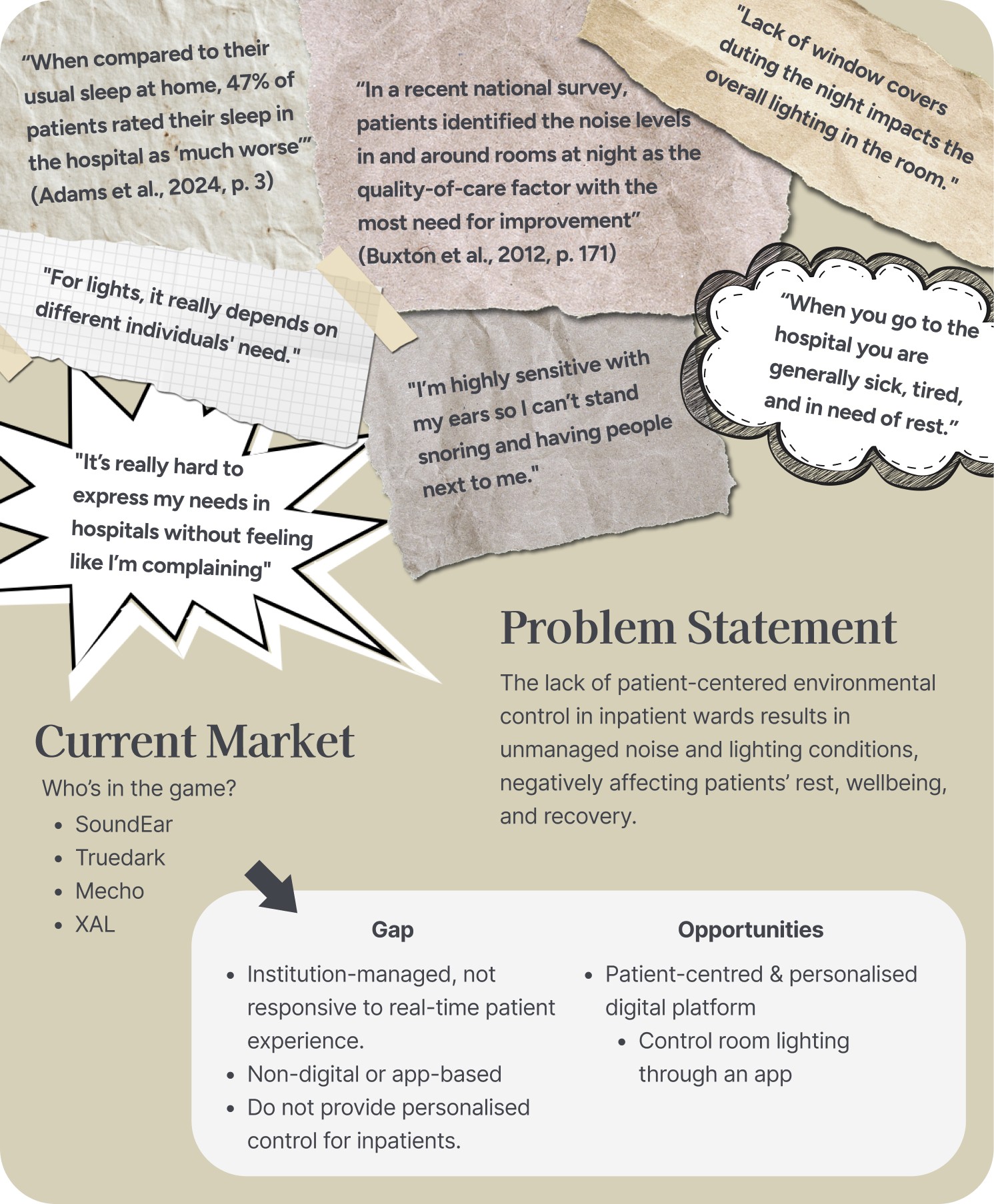
Problem area
Ideation - Storyboarding
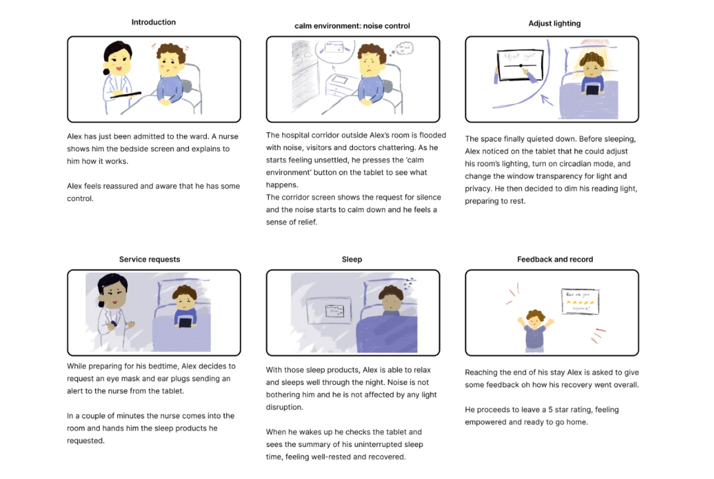
We created three storyboards exploring patient needs, communication, and circadian lighting.
After assessing them for practicality, patient-centeredness, and environmental comfort, we merged the strongest elements into a cohesive final concept. This solution allows patients to express their needs privately without confronting nurses or visitors, while giving them autonomy to adjust overstimulating or uncomfortable environmental conditions.
Evaluation - Decision Matrix
We brought the best ideas of each storyboard into our final design!
We considered…
Practicality:
Feasibility, usability and value
Patient-Centered Design:
Inclusivity, accessibility and freedom of patient needs expression
Environmental Comfort:
Effective light system modifications, noise reductions and clear visual cue communication
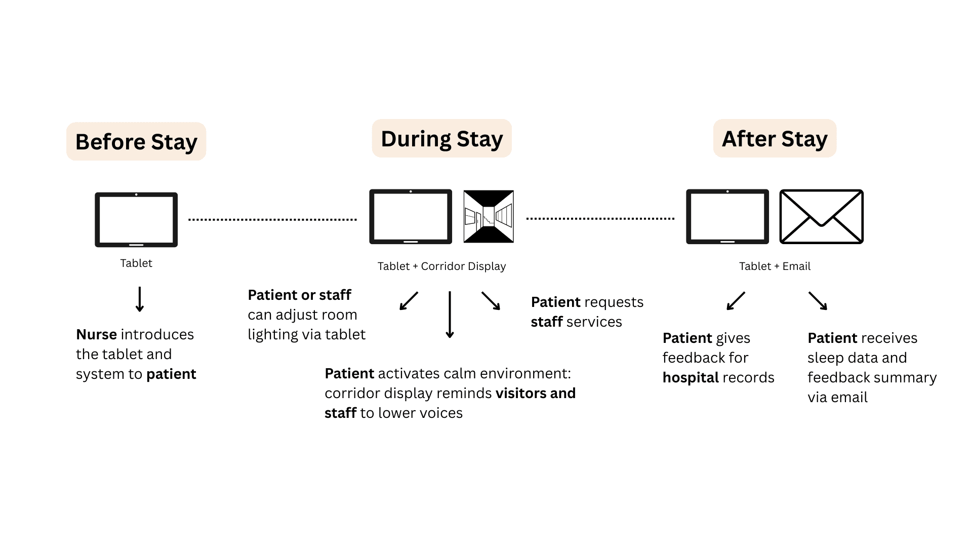
Omni-Channel Experience Scenario
Prototyping
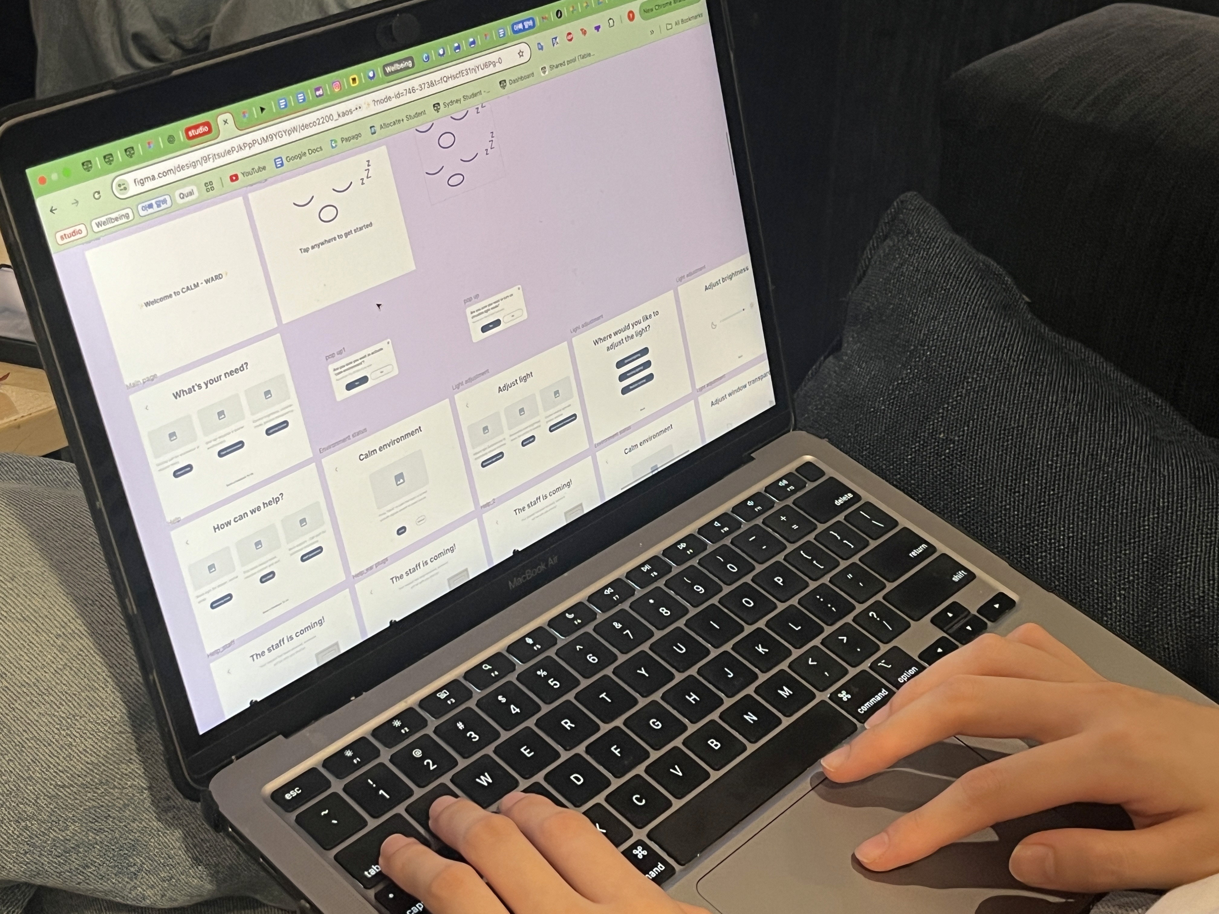
We then developed mid-fidelity wireframes to bring our concept to life. Our goal was to design an experience that feels effortless and calming for patients, especially when they are tired and in recovery. Each screen focuses on a main feature or idea, presented in a clear, minimal layout that’s easy to navigate and understand.
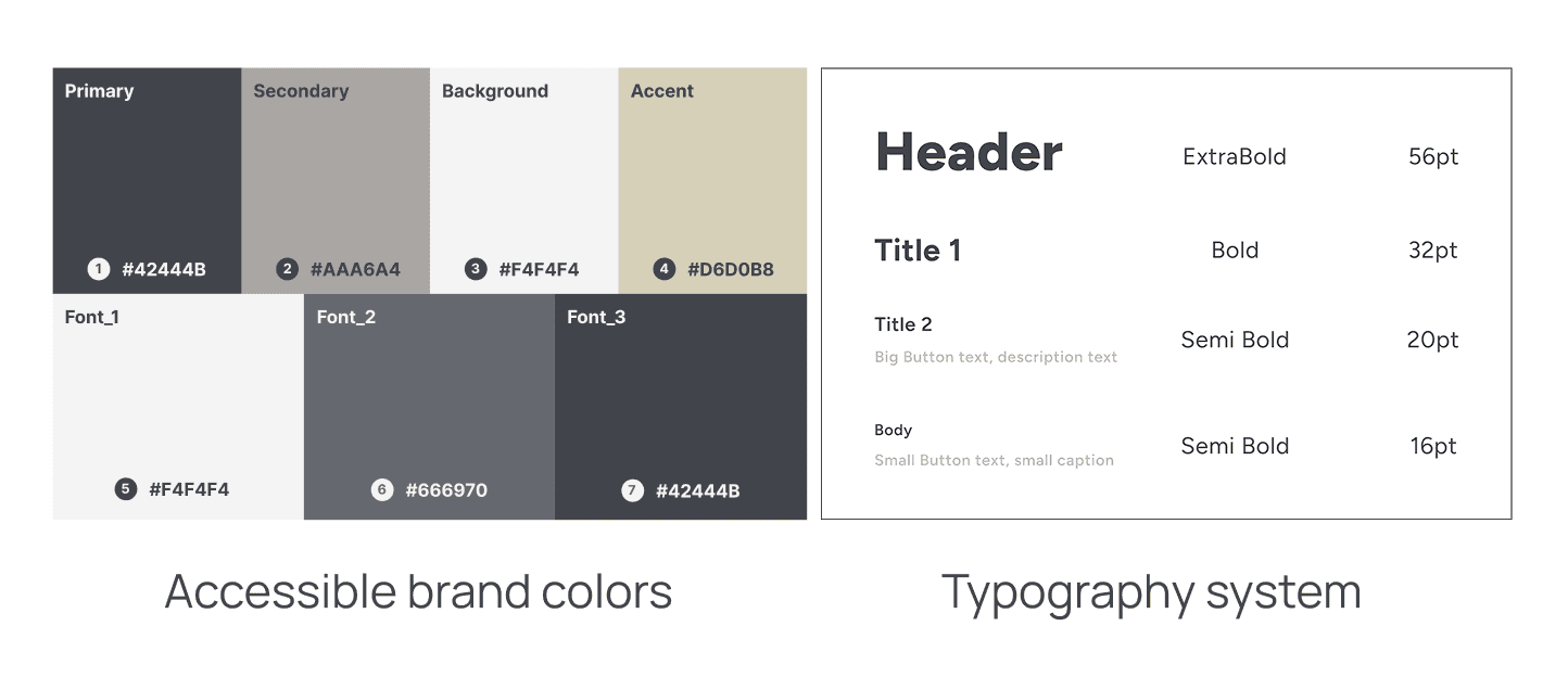
Designing For Accessibility
User testing
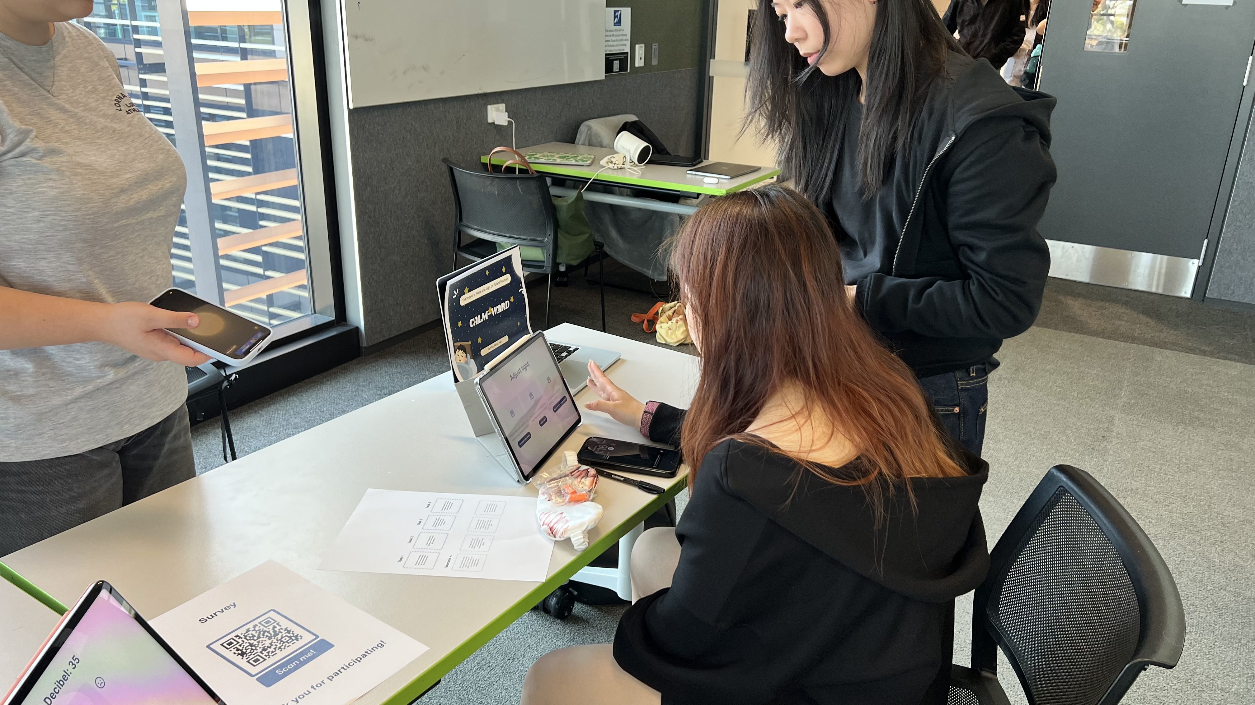
For our user testing we applied think-aloud method, interviews and SUS + UEQ surveys to evaluate the app’s usability, omni-channel interactions and overall experience. Through this testing, we ensured that the design gives patients greater control over their environment during their stay, supporting a smooth, intuitive, and stress-free user flow.
Evaluation
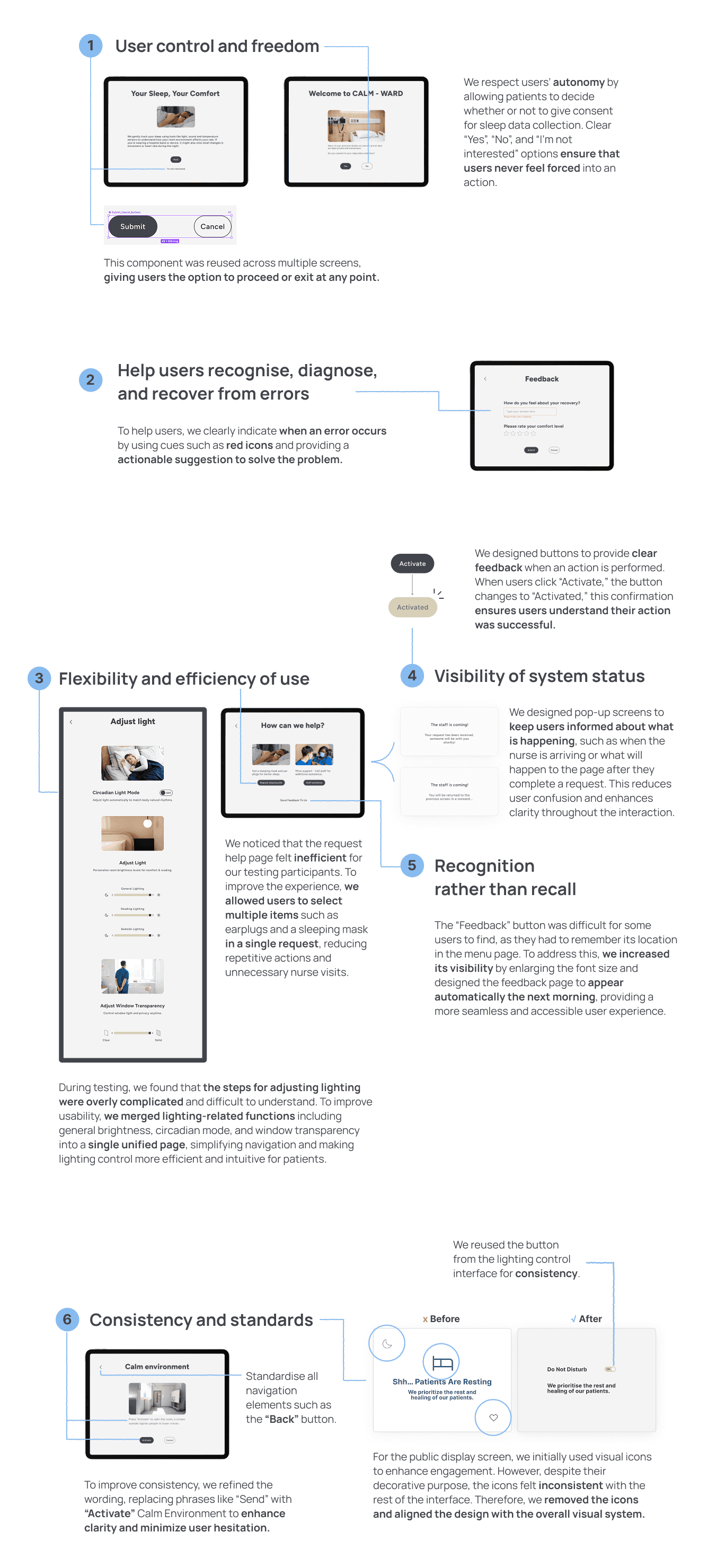
We analyzed the feedback using Nielsen’s heuristics establishing our own usability goals and defined key iterations to enhance the clarity, consistency, and accessibility of the overall user experience.
Final Design Showcase!
My Reflection
🧠 Learning to Design Within Constraints
One of my biggest takeaways from this studio was learning to design within constraints and real human conditions. In Calm Ward, we were designing for inpatients who are already exhausted and in need of rest. That pushed us to constantly ask how the solution could fit into a rigid hospital system while supporting patients without overwhelming them. It made me more aware of integration, simplicity, and the emotional impact of every interaction.
🫡 Learning from Industry Professionals
Throughout the course, engaging with industry professionals (UI/UX and product designers) taught me to consider feasibility, value, and real-world impact. I learned that successful designs need to be practical and achievable.
Thank you!